Some paint colors have had their moment in the spotlight, but even the most popular trends can overstay their welcome.
Designers know which shades have gone from chic to tired, and there are a few that they’d happily see disappear from walls for good. Whether it’s overly bold choices or uninspired neutrals, some colors just don’t stand the test of time.
Here are nine paint colors that designers wish would go away forever. If you’re planning a refresh, consider skipping these shades for something more modern and timeless.
Tuscan Yellow
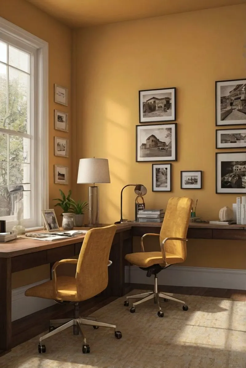
Tuscan Yellow, once loved for its rustic charm, now feels outdated and heavy. This color typically adorned kitchens and living rooms, aiming to replicate the warm hues of a Mediterranean villa. However, it often clashes with modern minimalist designs.
In contemporary spaces, it can feel oppressive and out of place, especially in rooms with less natural light. Designers suggest opting for lighter, more neutral tones that can brighten up the space and complement modern decor. Move away from this shade to embrace sleek, airy environments that feel fresh and inviting.
Mauve Madness
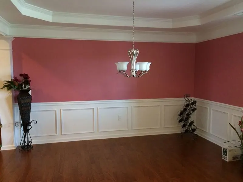
Mauve was once the darling of the 1980s, bringing a soft, romantic vibe to bedrooms and living spaces. Today, it often reads as tired and dated.
The subdued purple hue can make a space feel drab, especially when paired with old-fashioned floral patterns. Designers recommend exploring modern alternatives like soft lilac or blush, which offer a fresh twist on muted purple.
These updated shades work well with contemporary furnishings, adding a touch of whimsy without the dated feel. It’s time to let go of mauve and embrace the new.
Hunter Green
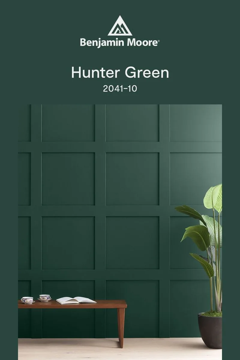
Hunter Green, a staple of the 1990s, was beloved for its rich, deep tone. However, it can make spaces feel dark and enclosed.
This color is often associated with traditional libraries and studies, filled with heavy furniture and dim lighting. While it can add a sense of coziness, it also limits the versatility of a room’s design.
Designers now lean towards brighter greens like sage or olive, which preserve the organic feel while adding lightness. By ditching hunter green, you open up your space to more modern possibilities.
Dusty Rose
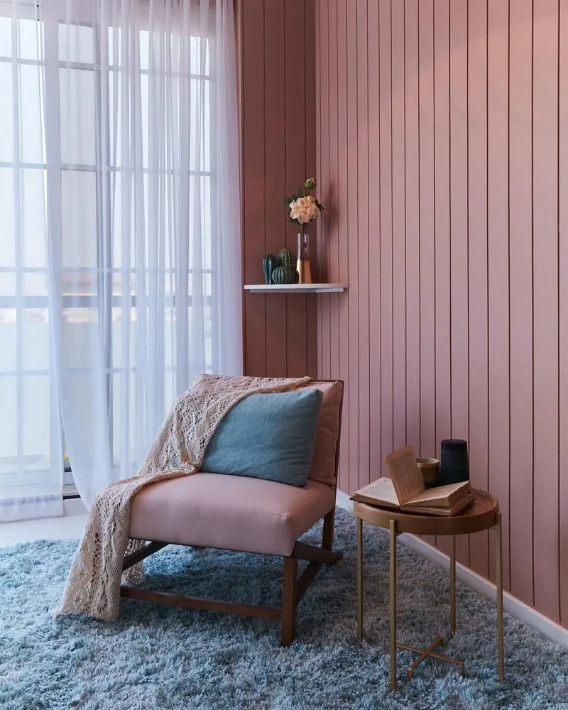
Dusty Rose, often used in nurseries and bedrooms, carries a vintage charm that can feel outdated today. This muted pink evokes nostalgia but can make spaces appear dull.
Designers are moving towards more vibrant pinks that energize and modernize interiors. Options like coral or blush provide a lively alternative that still maintains a sense of warmth and comfort.
By updating dusty rose, you transform a tired space into one that feels fresh and invigorating, perfectly suited for contemporary design styles.
Terracotta Overload
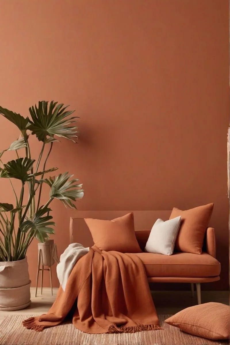
Terracotta, inspired by earth and clay, can sometimes overwhelm a space with its intensity. Once popular in bohemian settings, it can dominate a room, leaving little room for versatile decor.
This color can overshadow other design elements, creating a monochromatic look that feels stifling. Designers suggest muted alternatives like sandstone or tan for a more balanced aesthetic.
By reducing terracotta’s dominance, you allow for greater creativity in interior styling, aligning with a broader range of themes and personal expressions.
Peach Perplexity
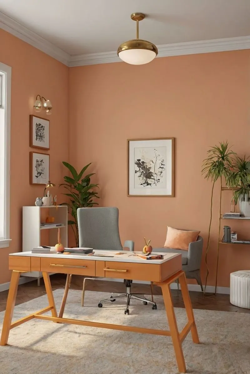
Peach was a staple in the 1970s, often seen in bathrooms and kitchens. While it was once considered cheerful and vibrant, it now appears dated and uninspiring.
This hue can clash with modern elements, limiting design flexibility. Designers propose shifting to neutral peaches or softer tones that add a subtle, contemporary charm.
These alternatives integrate seamlessly with modern fixtures and layouts, providing a sophisticated update that still respects the playful essence of peach. Embrace the change for a refreshed look.
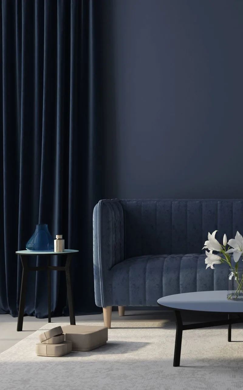
Navy blue, while timeless, can sometimes overpower small spaces, making them feel cramped. This color was frequently used for its perceived elegance and masculinity.
However, in confined areas, it absorbs light and reduces the perception of space. Designers now prefer lighter blues or even deep teals, which offer sophistication without overwhelming.
These modern shades allow for greater light reflection, enhancing the room’s openness. Transitioning from navy to these alternatives can breathe new life into dark, enclosed spaces.
Beige Blase
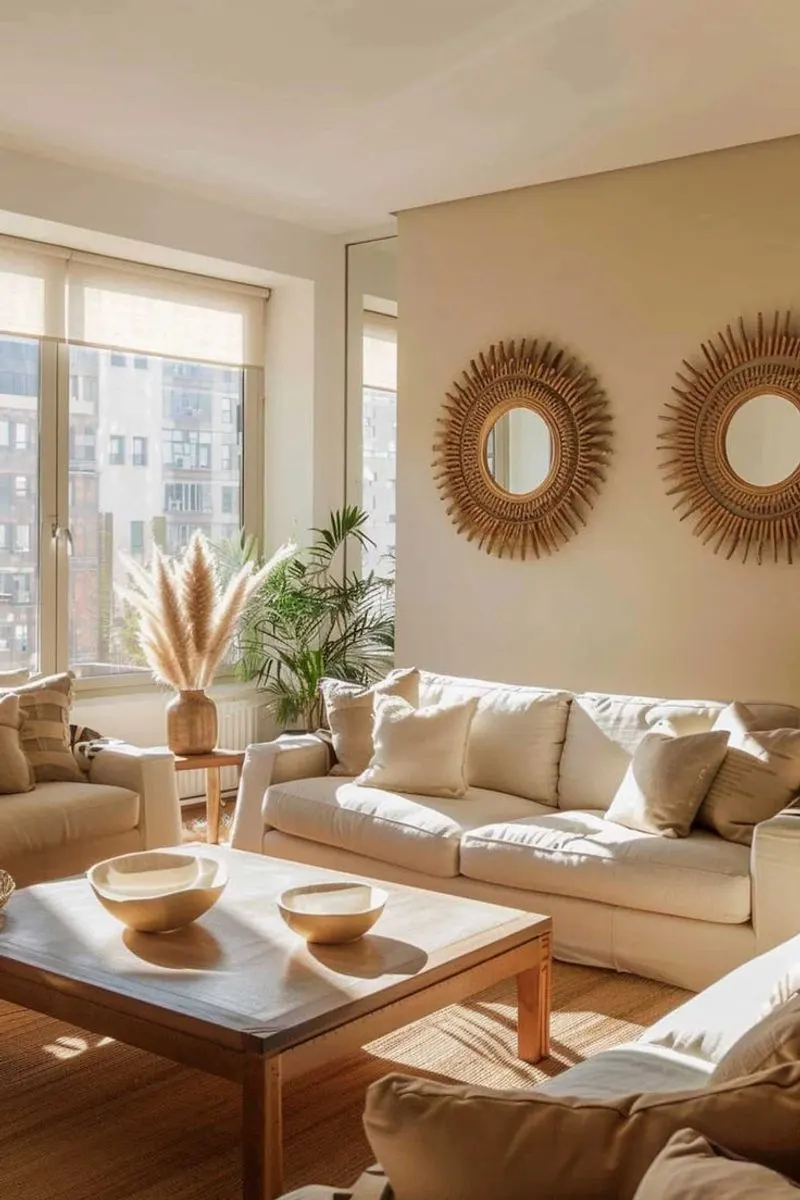
Beige, once a go-to neutral, has become synonymous with blandness. Its overuse has led to uninspired, monochromatic spaces lacking personality.
While it provides a safe backdrop, it often fails to excite or interest. Designers encourage experimenting with warmer neutrals like taupe or greige for added depth and character.
These shades maintain the versatility of beige but introduce subtle contrasts that elevate a design. Moving away from pure beige opens up possibilities for more dynamic and engaging environments.
Mint Green Meltdown
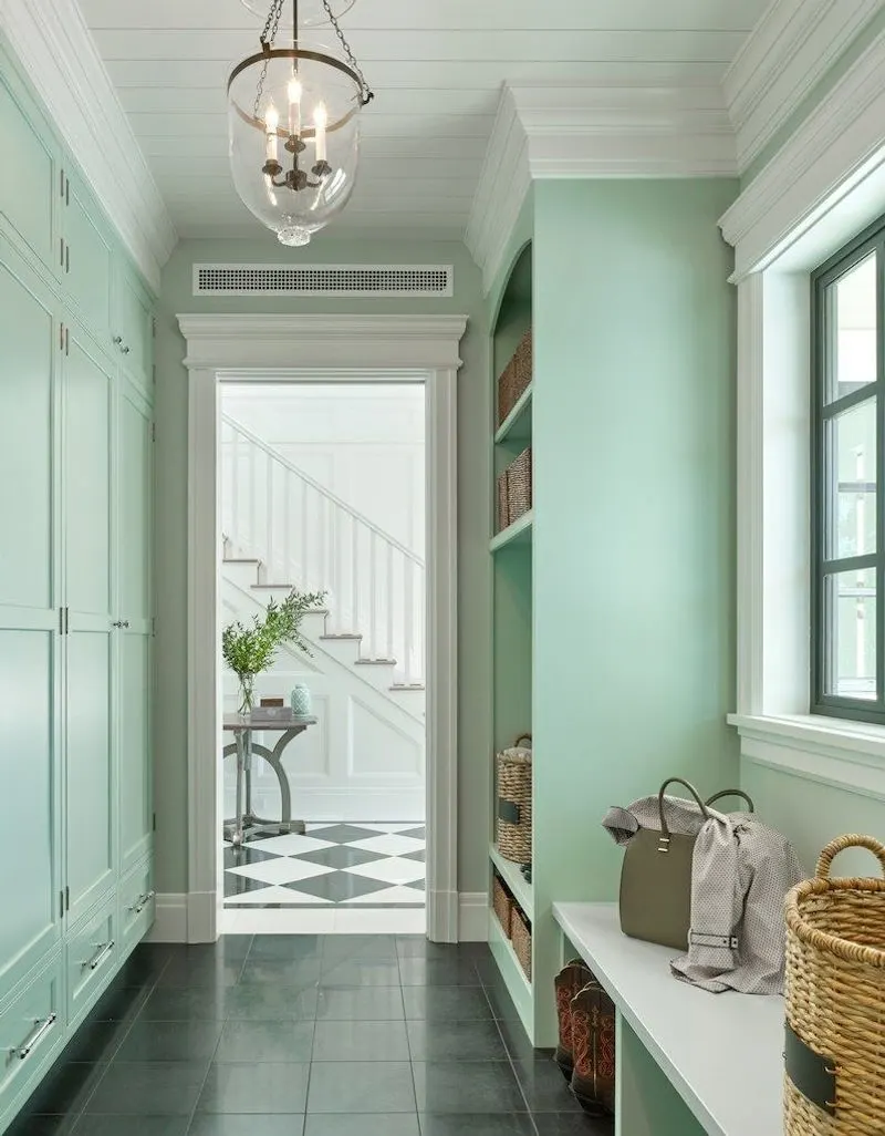
Mint Green, popular in the 1950s, adds a retro flair that can feel gimmicky today. While charming, it often limits the ability to modernize a space.
This shade can clash with contemporary colors and furnishings, making interiors appear stuck in a past era. Designers suggest exploring seafoam or pistachio as more versatile options.
These hues offer a nod to mint’s freshness but blend seamlessly with modern decor elements. Updating from mint allows for creativity and a timeless aesthetic that transcends trends.

